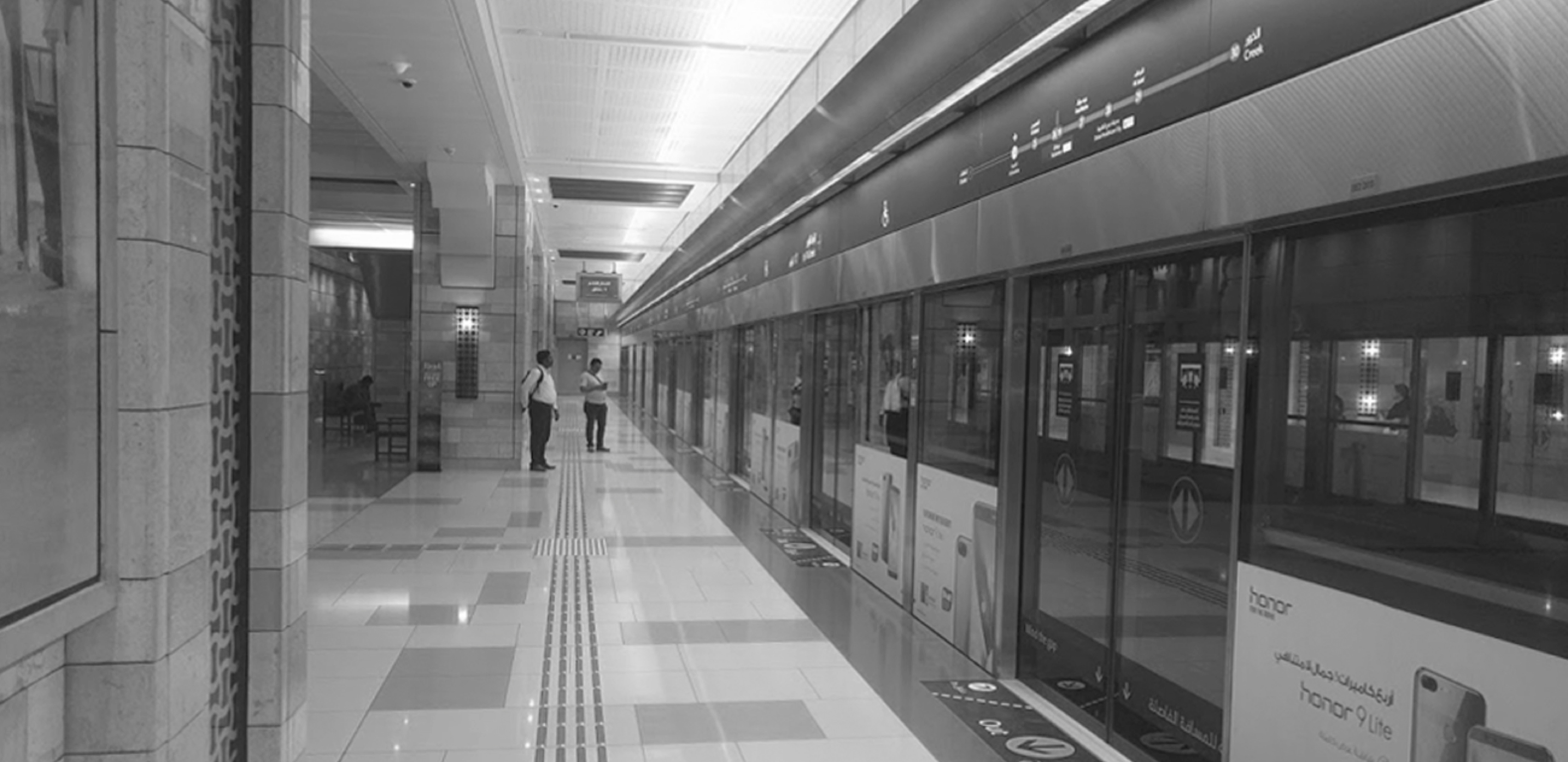
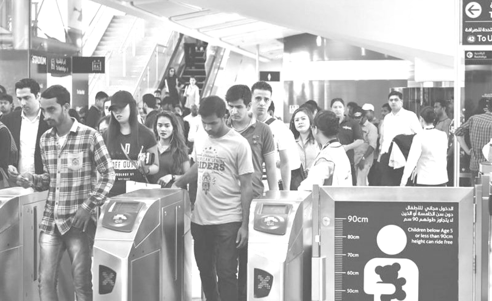
However, Dubai metro is far from being typical. There are many rules that are bound to the cultural background of the place. For example, did you know that men and women travel in separate carriages, and there are even the Golden Class carriages for the wealthier passengers? Or that you can only pay with a special Nol card for your ride?
Dealing with all those differences requires a friendly hand to help.Unfortunately, there is currently not much assistance on this matter. That’s the challenge our team decided to face and overcome as a way to find a mobile solution that might fit both this atypical kind of metro as well as propose a new concept of building a public transportation app for large as well as highly touristic cities.
This case study describes the process our team went through when redesigning this app as well as defines its functionality based on the insights we derived along the way.
Background
We came up with an idea of redesigning the public transportation app after one of our geeks visited Dubai for a vacation in January 2018. He was impressed by the city and, most of all, by its public transportation system RTA that included metro, buses, trams, and even water buses.
However, our colleague noticed that the public transportation mobile app was outdated, had limited functionality, and was hard to use on the run. So we decided to bravely (as we always do) redesign it.
Discovery
We didn’t find conducting a full benchmark analysis relevant for this project because it was supposed to be different from competitors at its core idea.Instead, we decided to build the functionality of the app by conductingbrainstorming sessions with our team, reading the users feedback for similar apps on Google Play, and talking to locals who regularly use public transport as well as tourists that visited Dubai before.
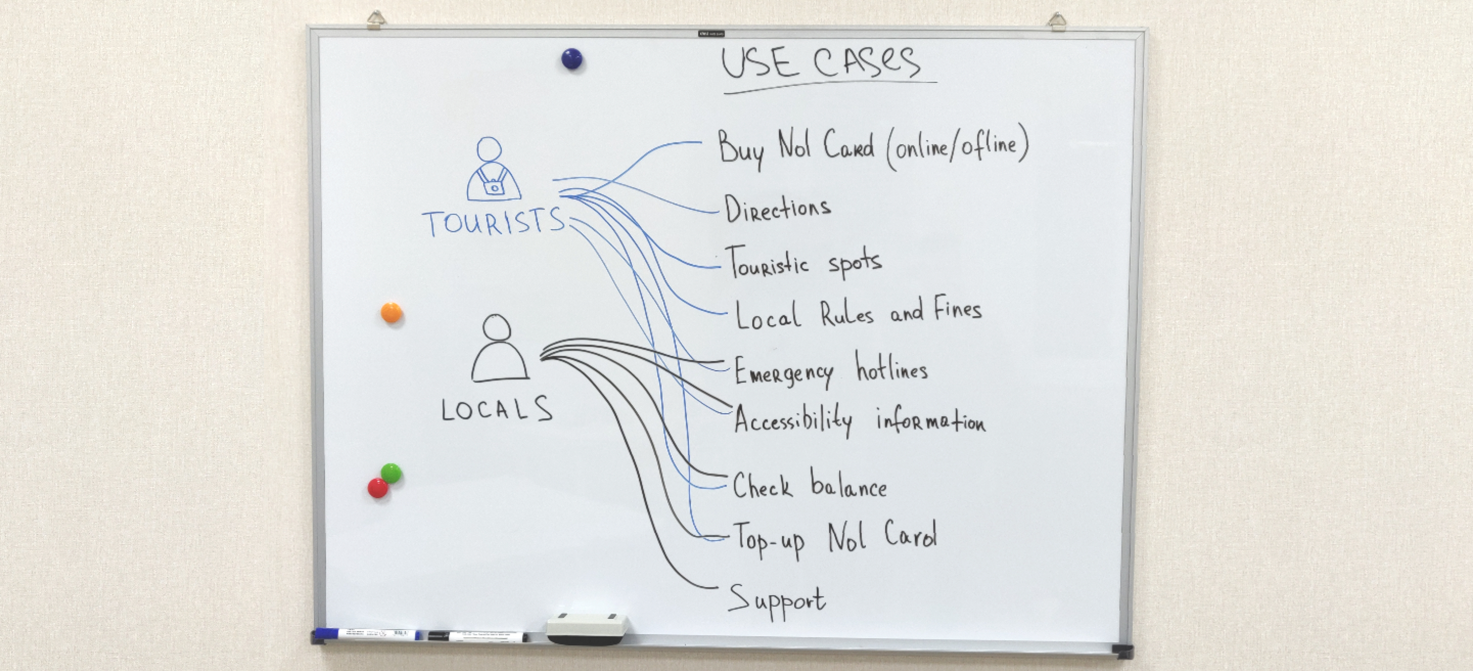
We started the project by defining two main target audience groups: touristsand locals. Thus, the app must function in a way that works efficiently for both of them. Then we focused on establishing a thorough understanding of the target audience acquired from their behavioral patterns and possible needs and expectation.
Next, we conducted an analysis of the challenges they might be facing and listed use cases for each of the groups. Those activities gave us significant insights into what tourists and citizens of large modern cities might be looking for when using public transportation.
Tourists
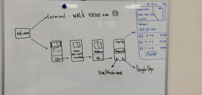
All public transportation in Dubai is bound by an e-ticket system called Nol.Nol cards are accepted in taxi, paid parking, public spaces, and parks. When a tourist first arrives in Dubai, he/she most likely doesn’t have a Nol card and barely has any idea of what it is and how to get one. For example, our colleague did struggle with that matter when he first arrived in Dubai and shared with us that other tourists he met during his trip had a similar experience.
There is more than meets the eye though. The system does not charge a fixed-price ticket to enter. On the opposite, the cost of the trip depends on how long it takes to get to the destination point. Thus, it is essential for a traveler to know the current balance of the Nol card and be able to top it up online at any moment.
Moreover, the rules and laws in Dubai are strict and, occasionally, differ from the ones western people are used to. For example, appearing in a public place under an influence of alcohol might even lead to immediate deportation. Of course, no one wants that to happen so knowing those rules in advance is a must in this country to avoid any trouble.
Based on the challenges tourists are facing, the following use cases were drawn:
- Purchasing a Nol card (online and offline)
- Checking the card balance
- Topping up the card
- Getting a Support service in the app
- Traveling around the city (navigation, visiting touristic spots)
- Getting to the desired destination
- Visiting prominent touristic spots
- Acquiring useful information about the city (local rules, fines, emergency hotlines, accessibility information)
Locals
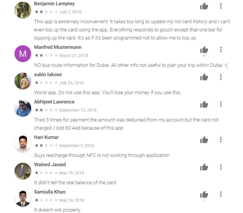
Locals, unlike tourists, generally know the city well so they are rather focused on checking their card balance and topping it up. According to the users’ feedback from the other apps, we found out that many of them currently struggled to do it on the run and they found the process of adding credit to the card bulky and unreliable.
Besides, there are many temporary workers with a lower income who are looking for a possibility of adding several Nol cards in one smartphone.
Based on the challenges locals are facing, the following use cases were drawn:
- Checking the Nol card balance
- Topping up the card
- Getting a Support service in the app
- Acquiring useful information about the city (emergency hotlines, accessibility information)
Functionality
The next step we took was to outline how the acquired use cases are going to be placed in our app.
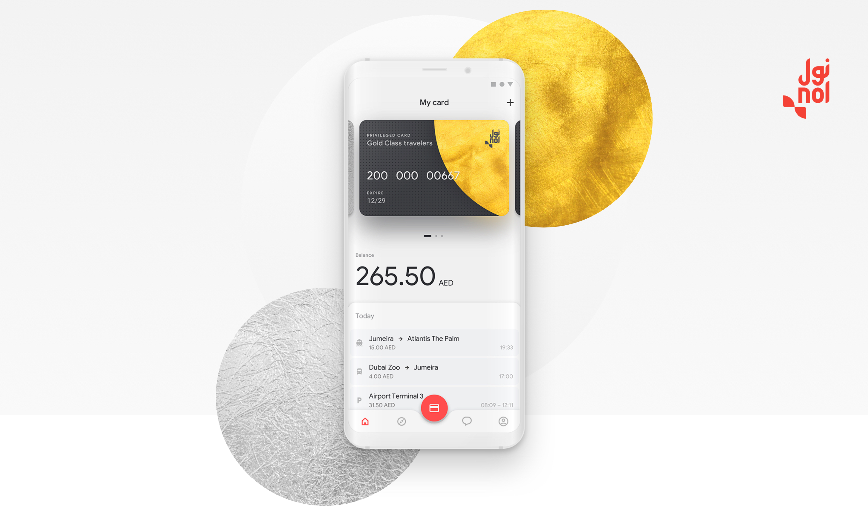
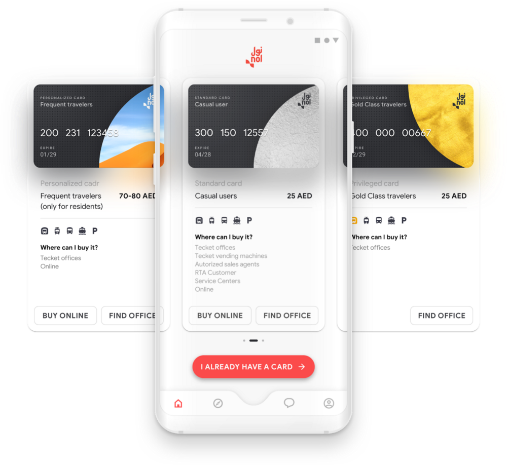
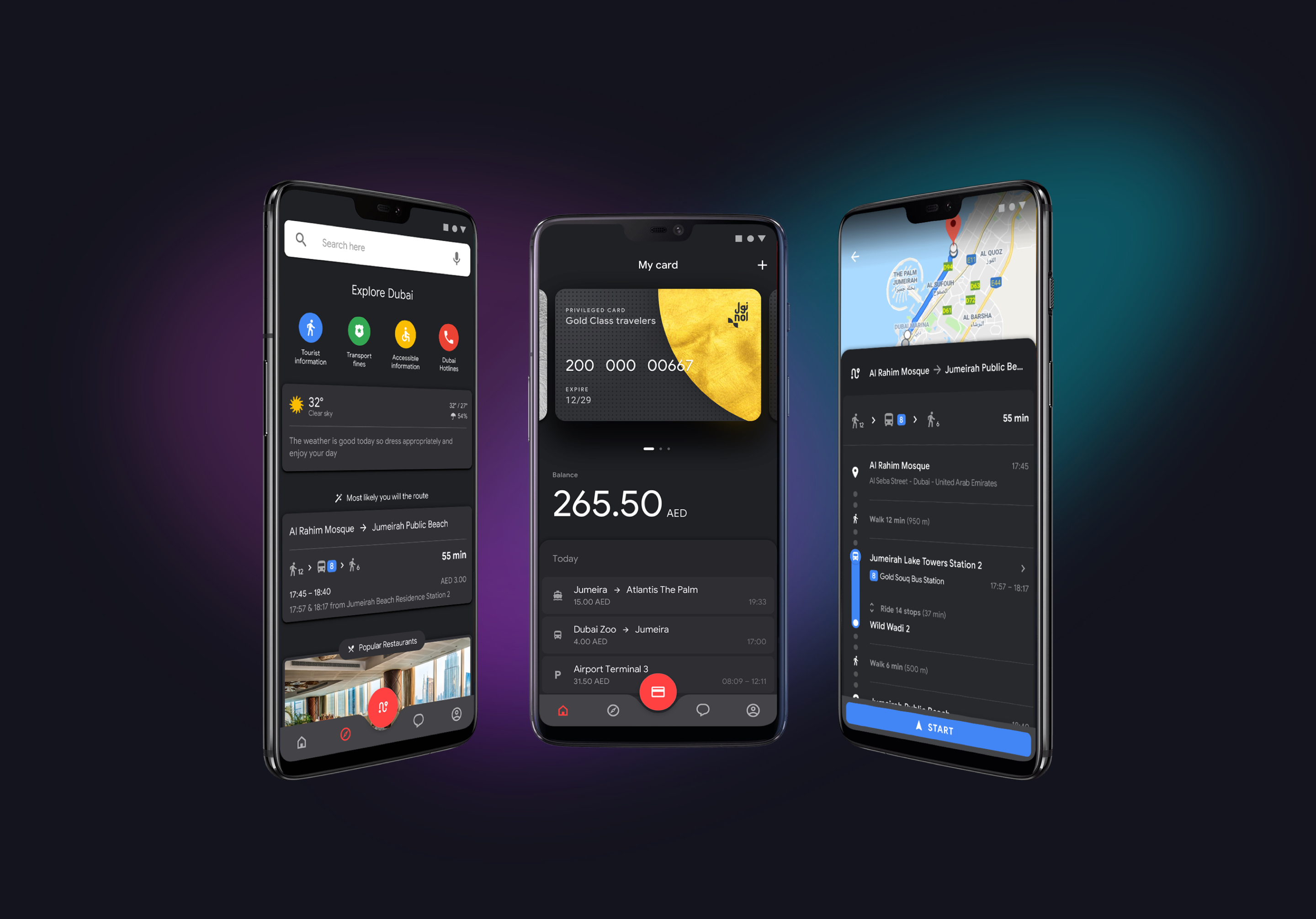
Nol card
A challenge most of the tourists are facing when first using public transportation in Dubai is figuring out what kinds of Nol cards exist and where to get one.
We understood that the Nol e-system was complex and tricky. That is why we added the screen that would appear at the first launch of the app. It provides a description of each Nol card type and suggests to either purchase one online or visit a nearby office to do it.
Balance and topping it up
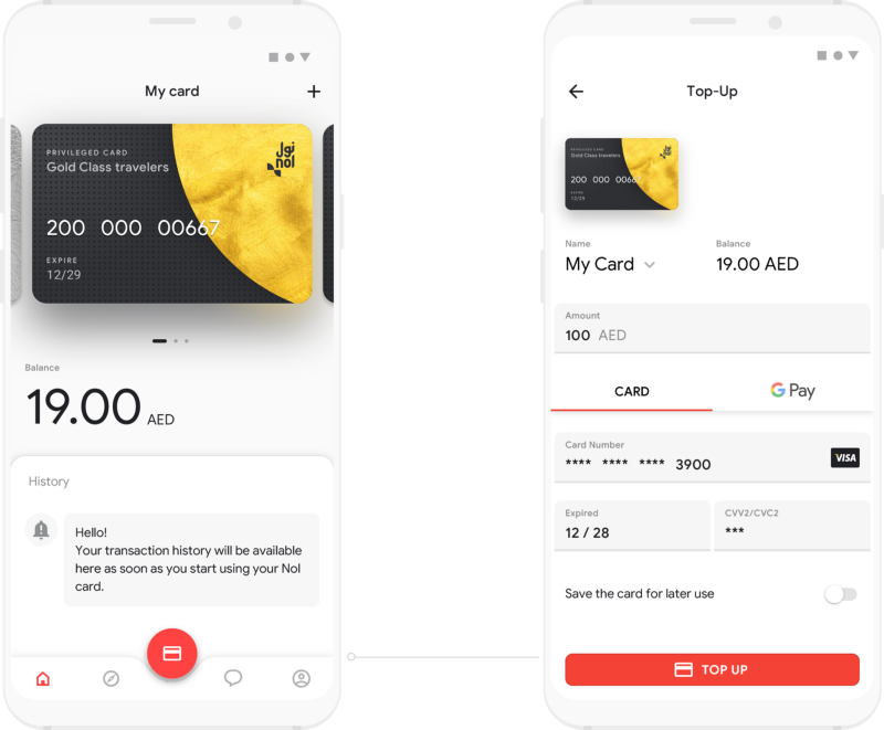
The app is now centered around its primary function of checking and topping up the Nol card balance.
One of the main issues we identified from the analysis of a users’ feedback for the similar apps was a high degree of the inconvenience they faced when adding credit to their Nol card.
Thus, our goal was to make sure that this process was as easy as possible so we came up with a complex solution for it.
The balance is instantly updated each time the user opens the Home button.Moreover, the app allows adding several cards on that screen and changing between those by swiping to the left and right.
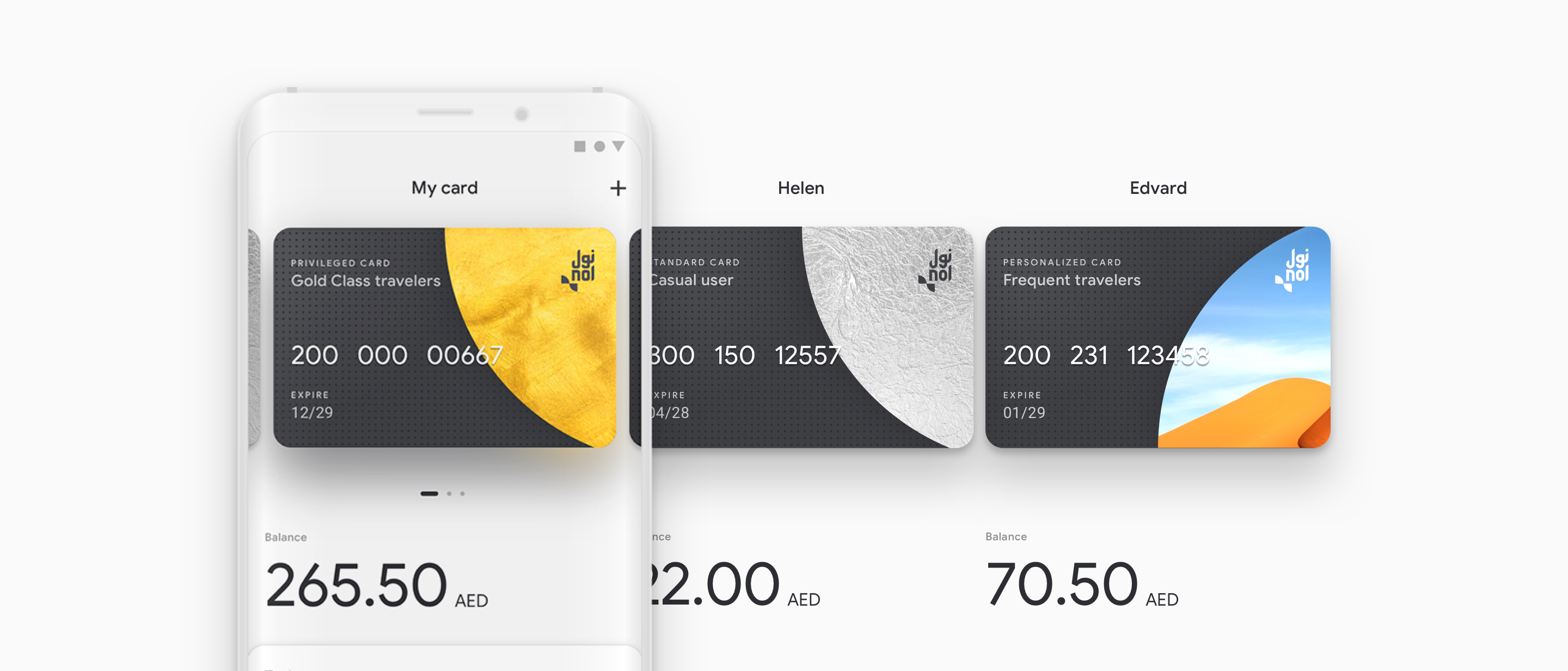
After a user fills out his Nol card details, the app automatically saves his/her card number and stores it only on the user’s device to make it personalized and safe to use.
The Top-Up feature is available in hard-to-miss Floating Action Button. There are two ways to make a payment: by either using Google Pay or adding bank card details.
People often tend to forget topping up a card in time and it usually happens at the least convenient moment, for example, at the metro station or a bus stop
Moreover, there has been a significant change in the way people interact with mobile versions of websites or apps since the screens of the smartphones are getting larger and larger. This directly impacts the way the UI for mobile interactions must be designed.
For example, according to one of thumb-friendly heat map analysis, the easiest-to-reach (green) areas are the left bottom corner of the screen whereas top left one is the hardest (red).
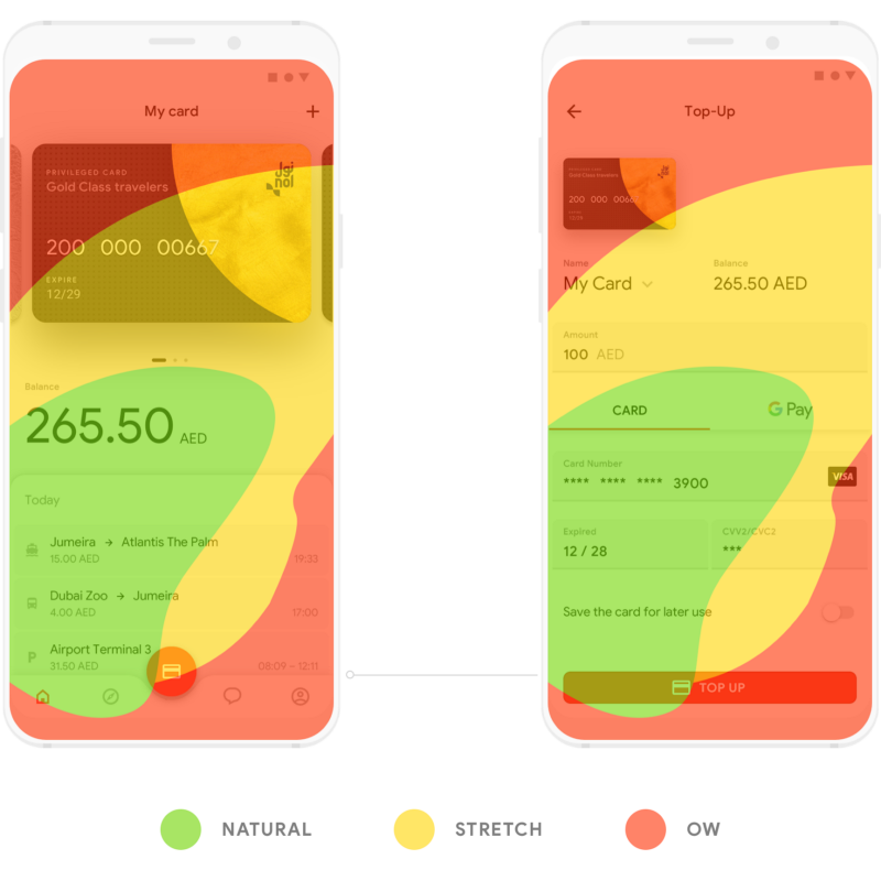
We usually take the heatmaps into consideration in order to increase the convenience of using the app on the run.
Hence, we placed the most important features of the app (home, navigation, top-up) in the green thumb zone and located the toolbar at the bottom of the screen instead of using a hamburger menu. For the same reason, the feature of saving a card for later, for example, is in the red zone to make sure it’s not pressed accidentally.
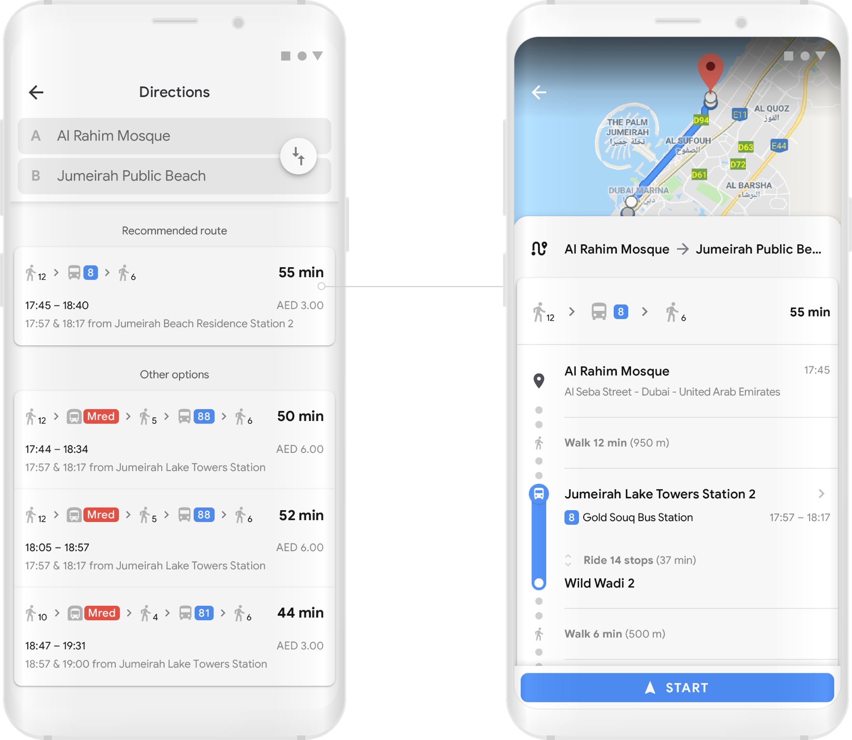
Navigation
The second priority feature was route planning.
Here, we assumed that the navigation was more commonly used by tourists, thus, we focused on making it highly adjusted to their needs and expectations.
Building a route directly in the app could significantly save users’ time and make sure they don’t miss any prominent sightseeing. We installed the navigation map features both on top of the screen and in the Floating Action Button.
The best solution for the Android devices was Google Maps because many people are familiar with it, and it is easily integrated into any external apps.
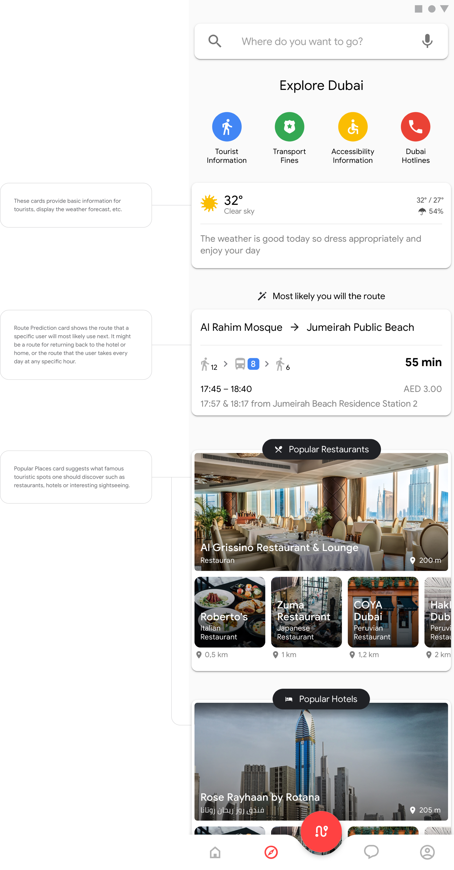
Intelligent feed
In order to make the app useful and engaging, we decided to apply an intellectual feed similar to Google Discover that is commonly used on Google smartphones. It stores information and suggests relevant tips without being intrusive.
Here are three goals we set for it: (1) provide users with information on the rules and laws in Dubai, (2) make the app intuitive and convenient, and (3)suggest users prominent touristic spots such as parks, sightseeing, restaurants, and parks.
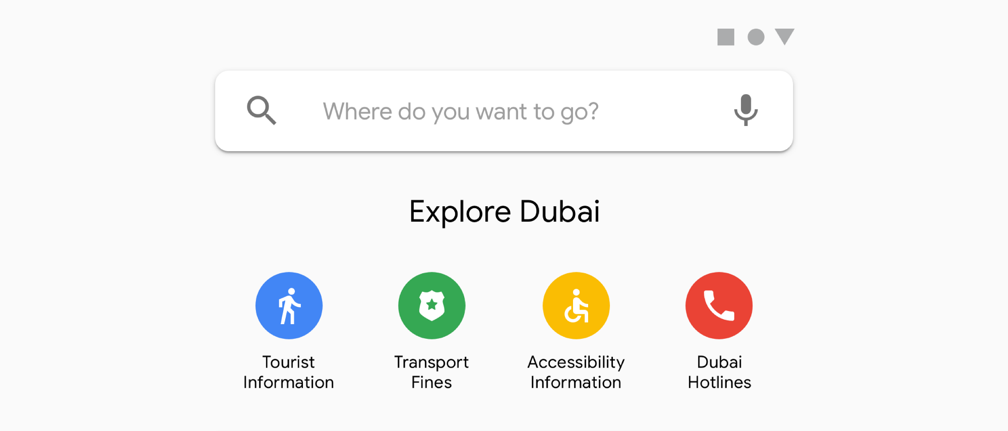
Explore Dubai section is supposed to provide additional value for tourists. It uses an intelligent feed concept to display the info cards when needed based on the person’s geo position and usage history. These cards share basic information on rules and laws for tourists, give users a quick access to emergency hotlines, display the weather forecast, etc.
Route Prediction card shows the route that a specific user would most likely use next. It might be a route for returning back to the hotel or home, or the route that the user takes every day at any specific hour. This feature could be helpful for locals too.
Popular Places card suggests what famous touristic spots one should discover such as restaurants, hotels or interesting sightseeing.
Night theme
We know that each person is different and has his/her own perception of design. So we proposed a choice of two themes: Standard and Night.However, its purpose was not only to adjust to the personal taste preferences of the users but to also add more value to the app usability.
For example, running out of battery in the middle of an unknown city is a common situation to happen. That sure is not a pleasant experience. Therefore, prolonging the phone lifetime could be of a great value, especially in cases of traveling.
It is well-known that the smartphones with AMOLED screens consume significantly less battery with a dark theme VS a white one. Therefore, the Night theme would be of a great help here. The darker color scheme is also more convenient for the eyes at night time.
The theme of the app can be changed from Standard to Night manually.
Outcome
This project is not only about redesigning an atypical type of public transportation app but it also proposes an unconventional concept for a modern public transportation app that can be used in many other cities. It is adjusted to the local traditions and rules as well as makes navigation around the city intuitive and fun. The features we implemented reduce the stress of using the app on the run and let the app serve as a guide for both tourists and locals.