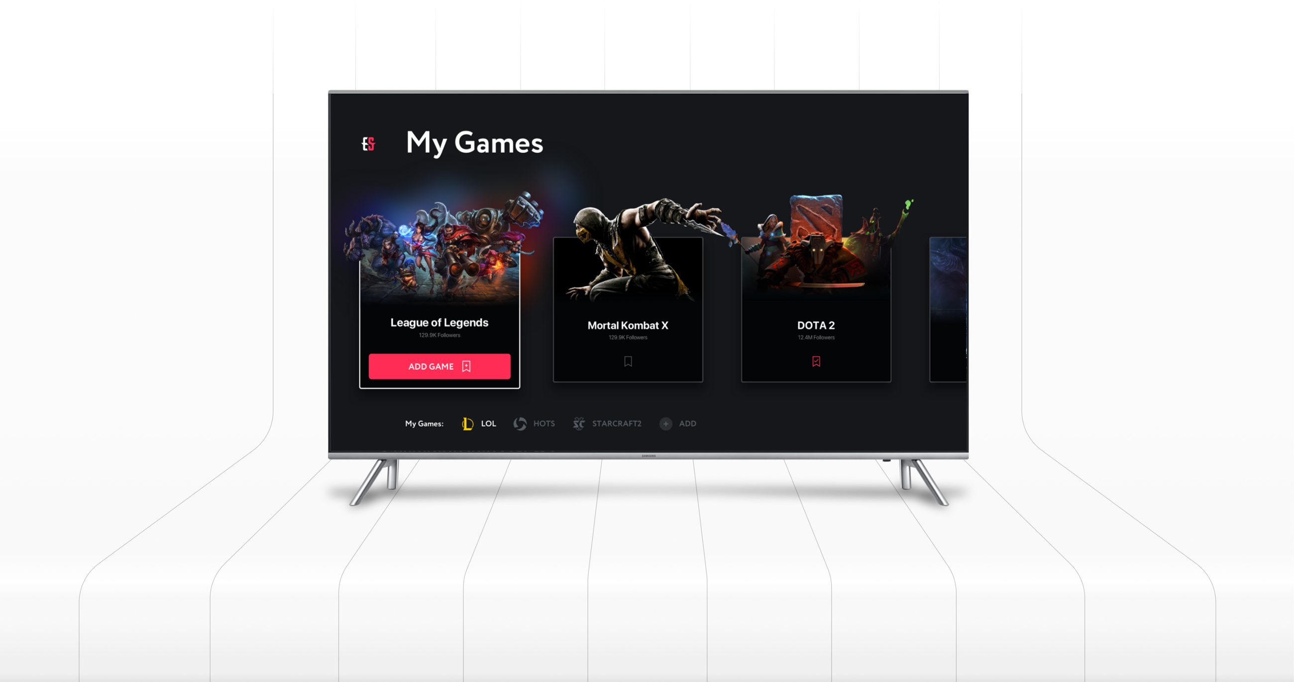
The computer game industry is huge. As far as production budgets and revenue go, it’s on par with the motion-picture industry. Red Dead Redemption 2, which came out in 2018, earned more than $725 million its opening weekend. For comparison, Han Solo, which also came out in 2018, earned only $84 million its opening weekend. But whereas computer games have already matured as an industry, eSports are only beginning to grow.
Alex Grey, a journalist for the World Economic Forum, reported that eSports audience will reach 380 million worldwide this year, comprising 165 dedicated fans and 215 occasional viewers. Forbes projected that the eSports industry would generate $905 million in revenue in 2018, reaching over $1 billion in the two years following.
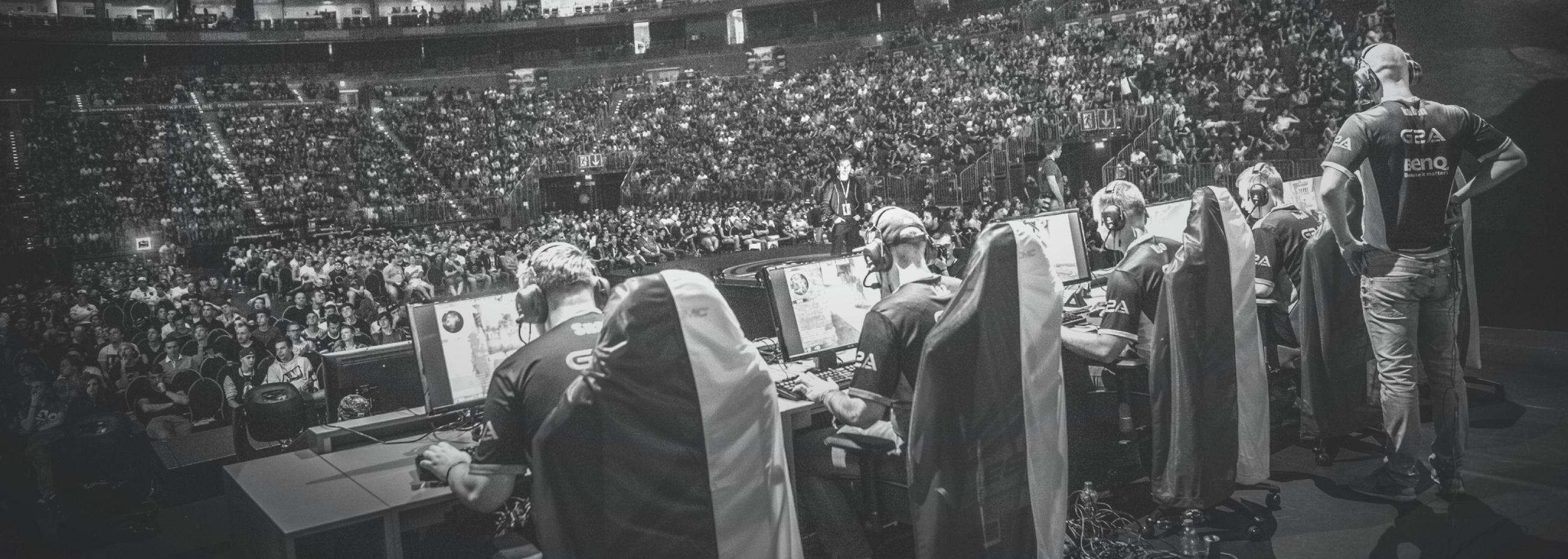
Here at BraveGeeks, we love games and we love eSports. It’s not uncommon for us to while away an evening watching streams of LOL or DOTA competitions with friends and colleagues. But despite its rapid growth, eSports is still a very young industry. We spent some time thinking about what the industry really lacks when compared to traditional sports competitions.
Discovery
One of our assumptions was that it’s still uncommon to find eSports in the core of the home — the living room. That’s where we usually watch competitions for traditional sports, like baseball, football, hockey, cricket, and soccer. And then we thought: eSports should be on television.
Well, you say, we already have Twitch and YouTube.
That’s true, and they’re great. But they’re all-purpose platforms. Twitch is intended mainly for individual streamers, and YouTube is for vloggers (and everyone else). Searching for streams of your favorite game’s competitions or interviews with your favorite players is difficult to do on these platforms.
To formulate, test, and finalize our thesis, we conducted a series of interviews with several eSports fans.
We asked the following questions:
- Which games do you watch competitions for?
- What device do you watch competitions on?
- What site or app do you watch on?
- What site or app do you use to keep up with eSports news?
Here’s what we discovered:
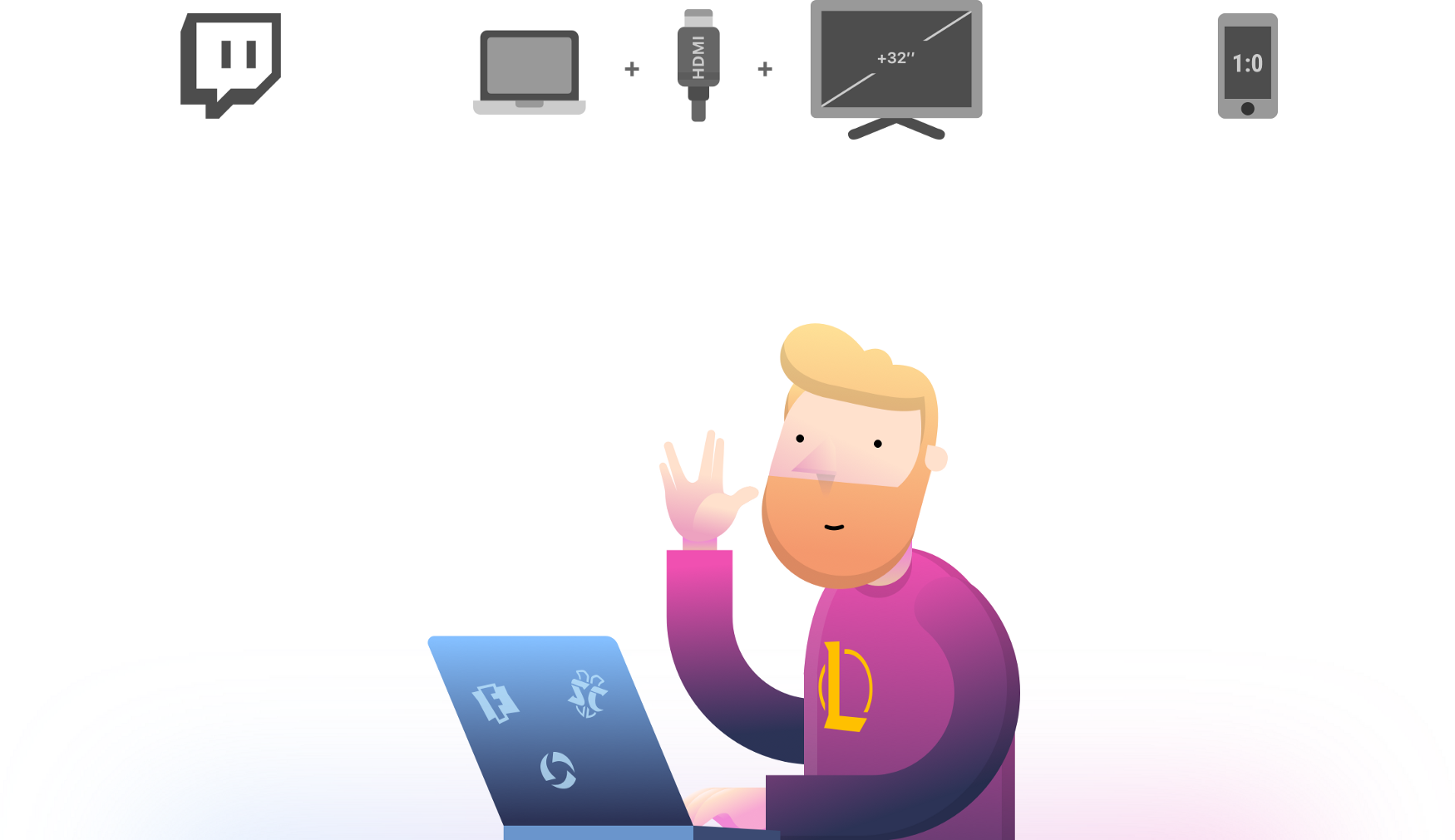
- Our respondents watch competition streams on Twitch or on tournament sites;
- They prefer watching competitions on big TV screens, although to do this they often connect their laptops to their TVs using HDMI cables;
- The majority of them have big-screen TVs (32-inch or bigger) with smart features (Tizen OS or Android TV), Apple TV, PS4, or Xbox One;
- They find news and tournament brackets on tournament sites, dedicated apps, and social media;
- They’re interested in competitions for more than one game, and they won’t watch just any tournament solely because it’s eSports.
Based on the results of our study, we refined our idea as follows.
We want to develop a concept for an app for TV. One that lets you:
- watch the latest competitions for any game;
- watch news stories about important competitions, favorite teams, and favorite players;
- personalize what you see: eSports is a diverse industry, and not everyone is into everything.
We’ve never developed an app for TV before, and we couldn’t pass up the chance to try something new. We decided to create a showcase project. And so the adventure began.
Challenges of designing for TV
Designing apps for TV is different from the designing we’re used to for web and mobile devices. We outlined the following challenges:
- Reading large amounts of text on a TV screen is uncomfortable
- The screen may be far from the viewer or close to them
- Televisions can be quite large
- The app should be easy to navigate using the device’s remove
All of this places restrictions on design.
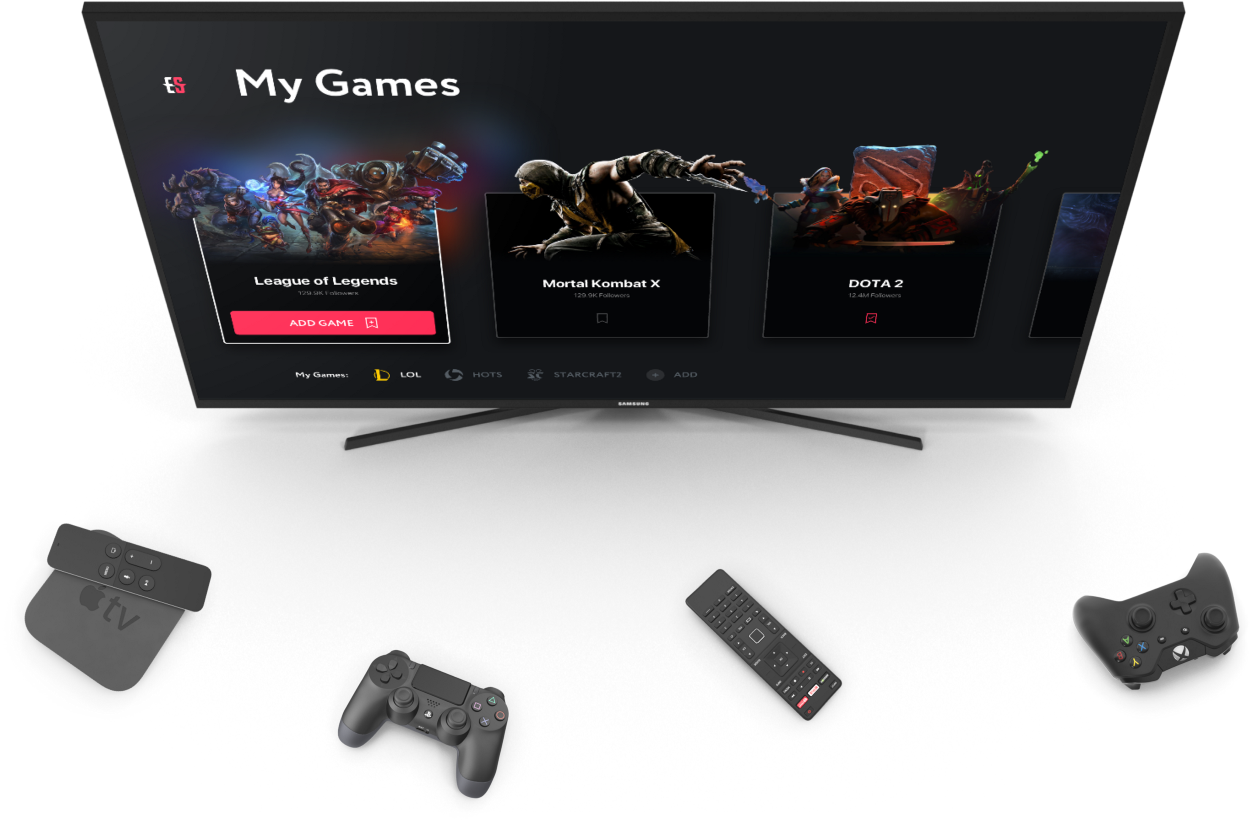
We studied dozens of apps on Android TV, Apple TV, and PS4 (we didn’t have Xbox One) to find out how developers usually solve the problems we identified, and here are our conclusions:
- The typography has to be simple, large, and clean
- Video content has to be emphasized and text has to be minimized
- Primary elements should be placed in such a way that the viewer doesn’t have to turn their head to see them
- Users should type as little as possible: for example, don’t request usernames/passwords and do away with classic searches and querying
Another point is that despite the abundance of diverse platforms we could use to launch our TV app (Apple TV, Android TV, Xbox One, TizenOS, etc.) there aren’t many stylistic differences between platforms. We concluded that a design developed for one platform could be adapted to another fairly easily.
Safe-zones
One of the most interesting parts of developing a design for TV was the need to consider safe zones. While exploring the issue, we found that we should arrange all UI elements so that none of them is in margins of approximately 5% on all sides.
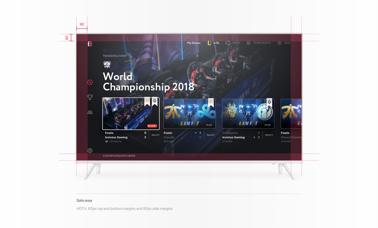
This stems from the fact that TVs sometimes still use outdated overscan behavior, which means that the edges of images may get cut off. This could happen regardless of which platform the app is released on (PS4, Apple TV, or on the television itself).
We recommend this series of articles from This Also, which is dedicated to
Design language
We began by determining the content for our app. After a series of discussions, we decided that we consider the main types of content to be:
- live streams and recordings of matches at eSports games;
- sports news in video format.
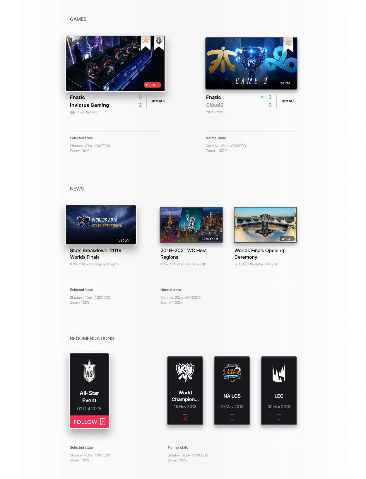
Then we determined the contexts in which this content was to be shown. These had to be important areas of common interest for eSports fans. We assumed that these would be championships and teams.
Navigation
During the interviews, we discovered the following problems, which we had to account for when developing the app’s navigation.
- Users are often following several eSports games;
- Each game has a lot of content, and it wouldn’t be right to mix content from different games.
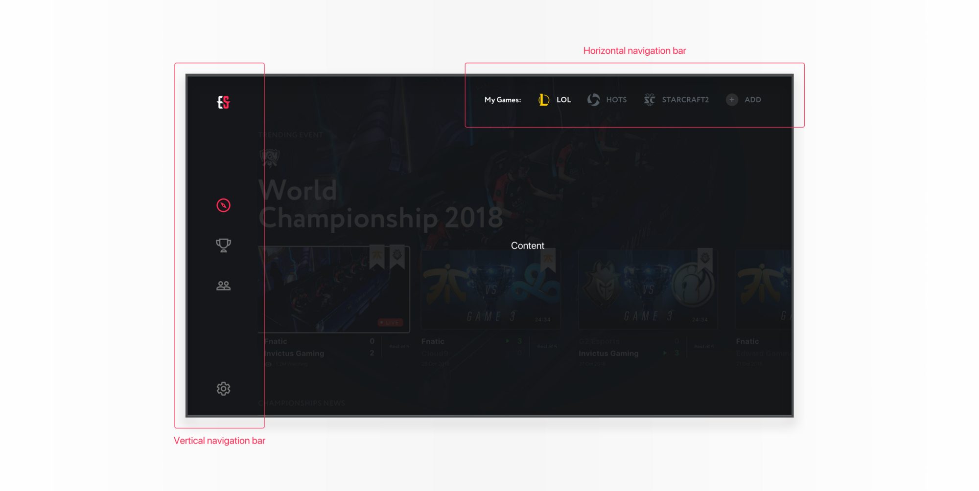
We decided to implement dual navigation, despite the fact that this generally complicates applications. We implemented a horizontal navigation bar at the top for switching between games and a vertical navigation bar on the side for switching between sections.
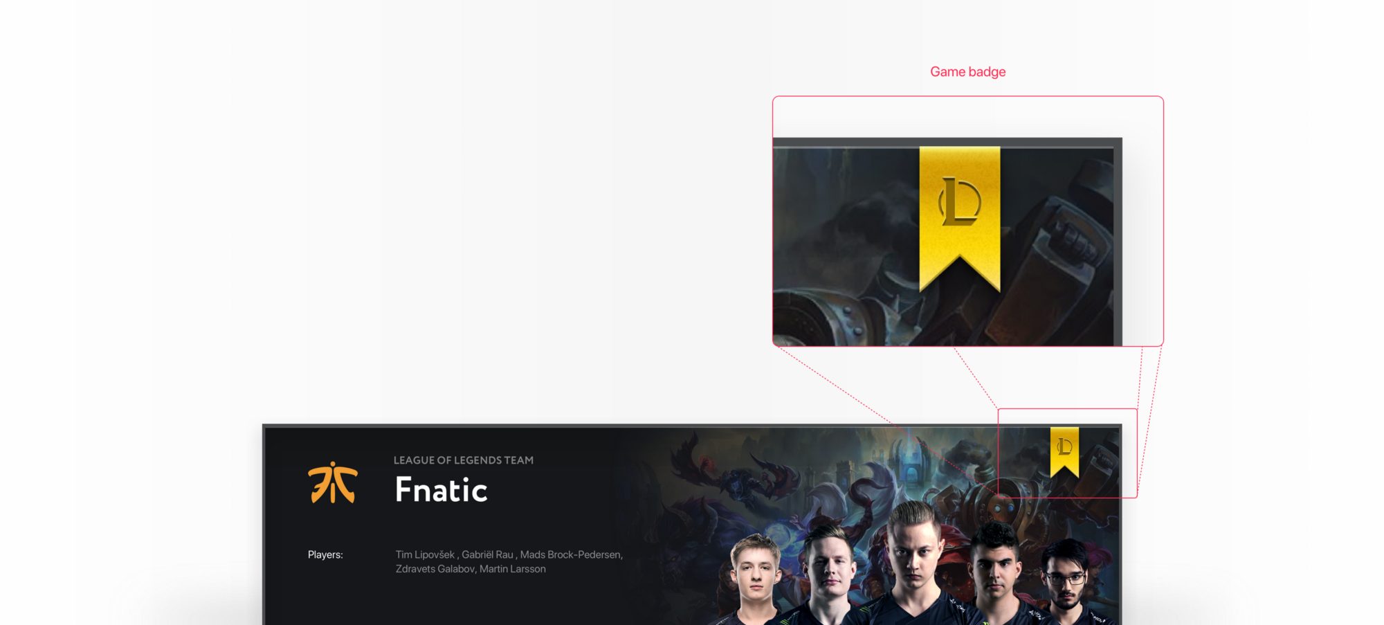
Users can easily switch between games in each of the main sections. On internal screens, where users can’t switch between games, we display an identifying game badge.
Championships
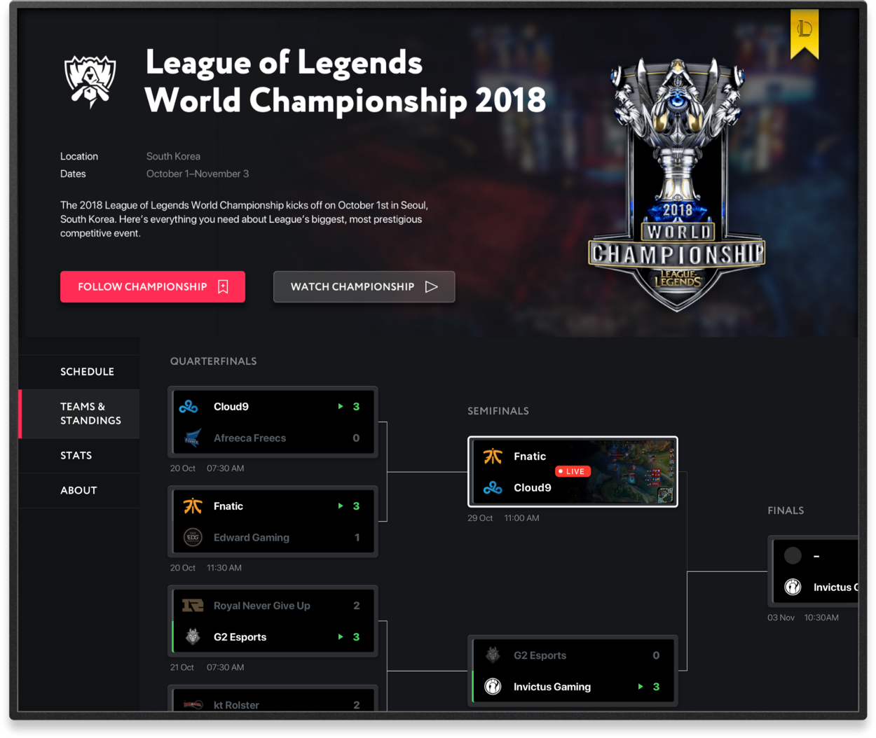
Championships are the main events in eSports. Users need to be able to both watch matches and check championship progress through brackets.
Users can follow championships, and when they do, the latest news and matches from the championship will appear on the app’s home screen.
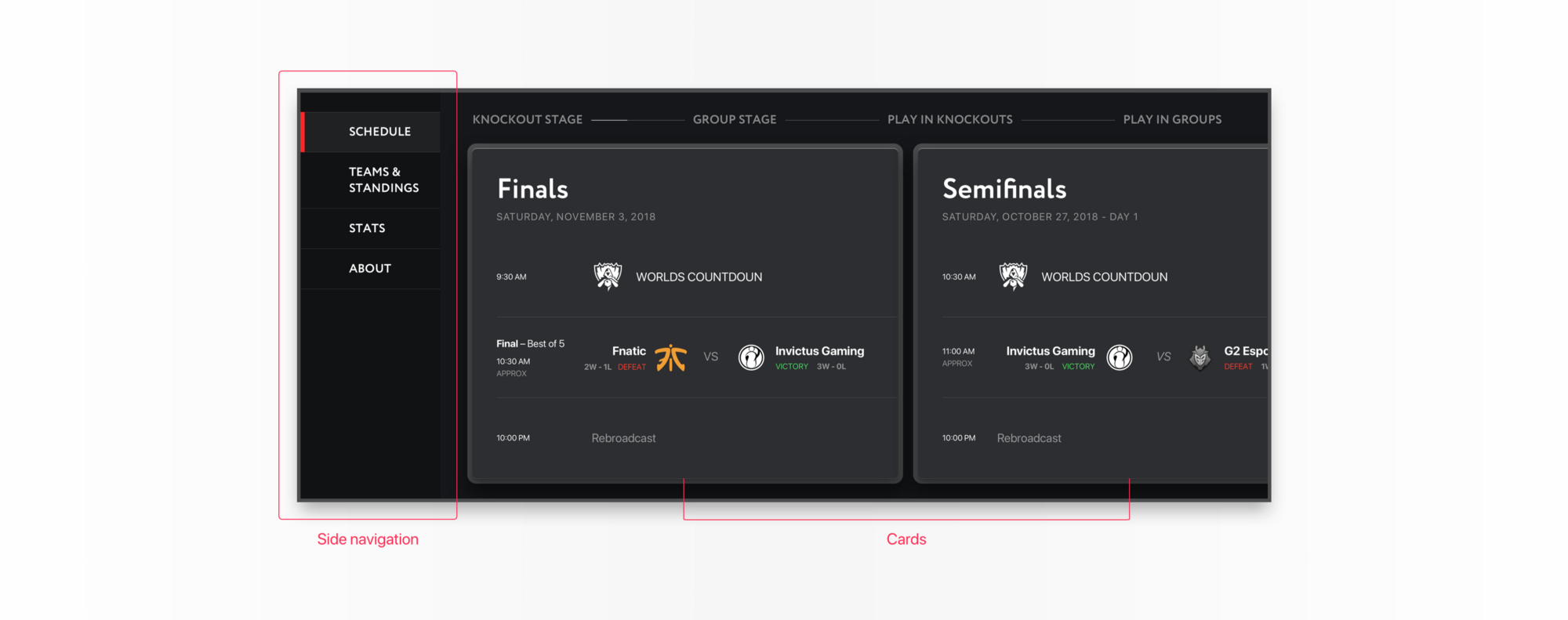
In order to fit everything on one screen, we were forced to add an additional side navigation bar, with information divided into cards.
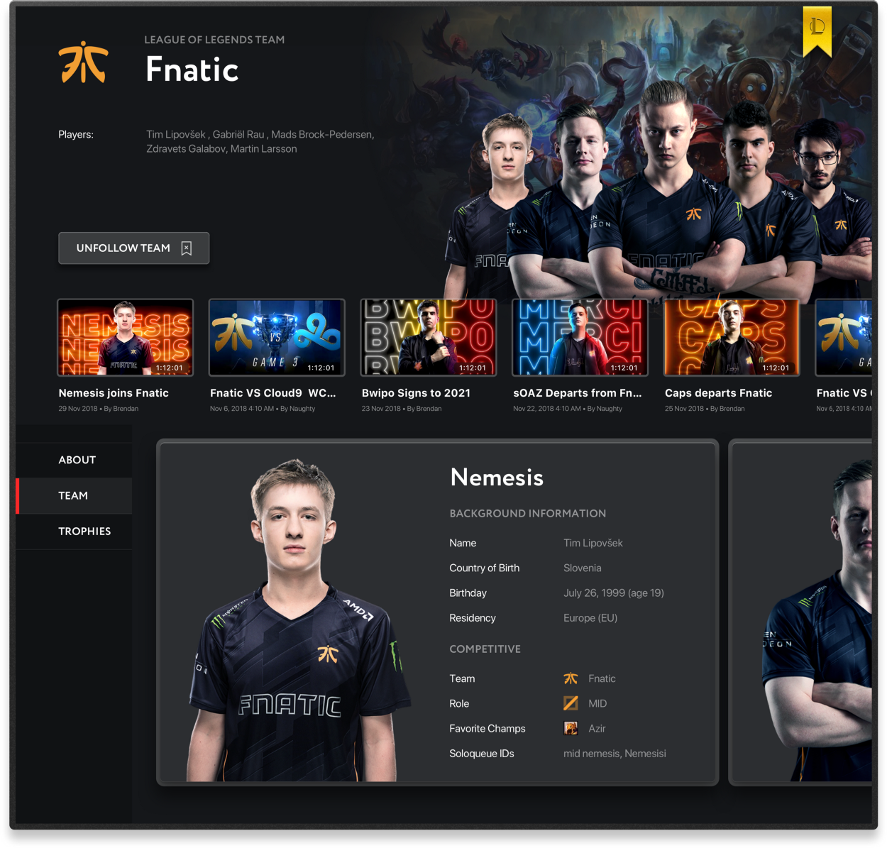
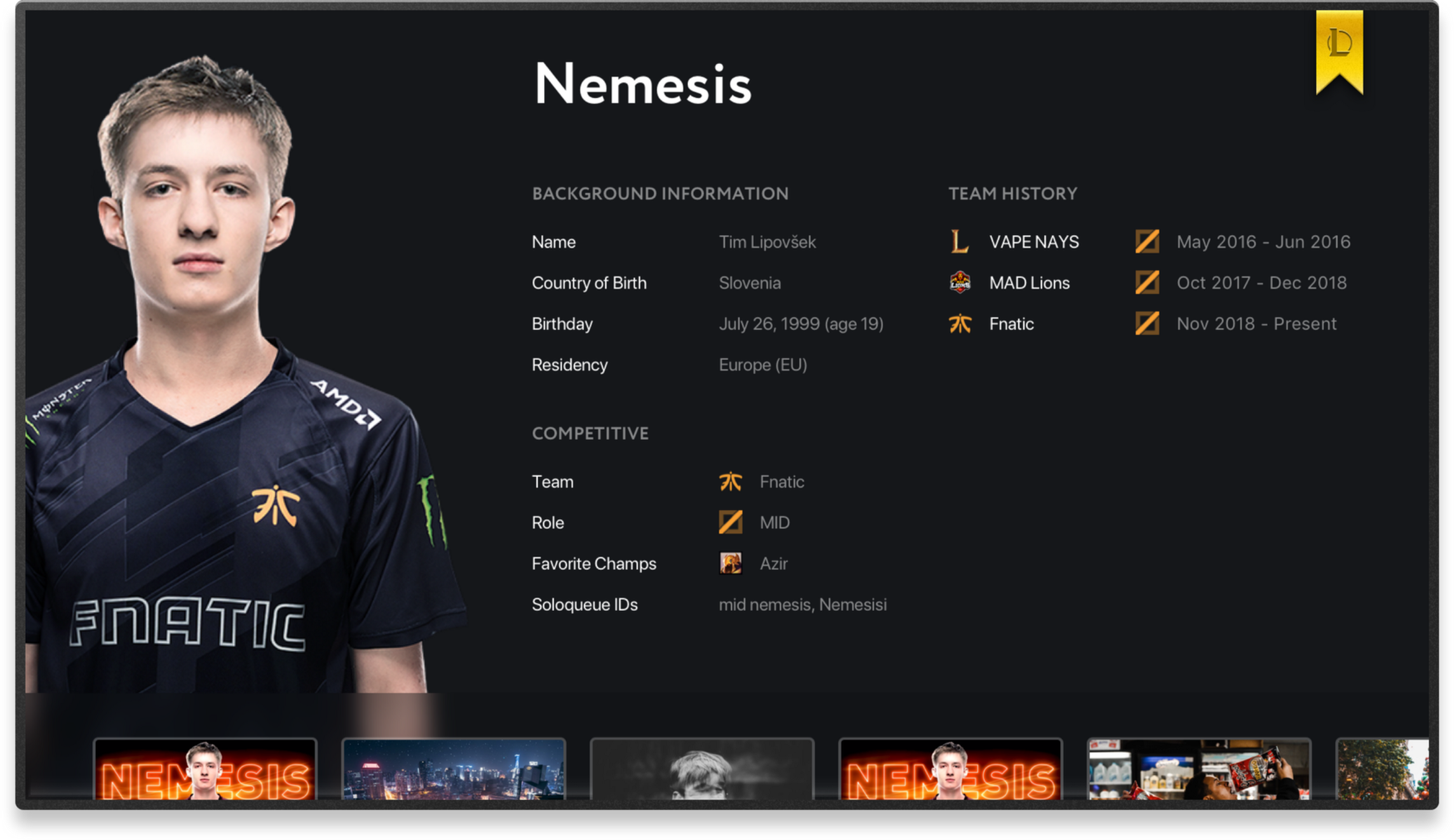
Teams and Players
Teams can appear and disappear quickly in eSports, and players on a team can change often, too; so it didn’t seem unreasonable for us to include the ability to check the current members of a team or the profile of a specific player.
Home screen
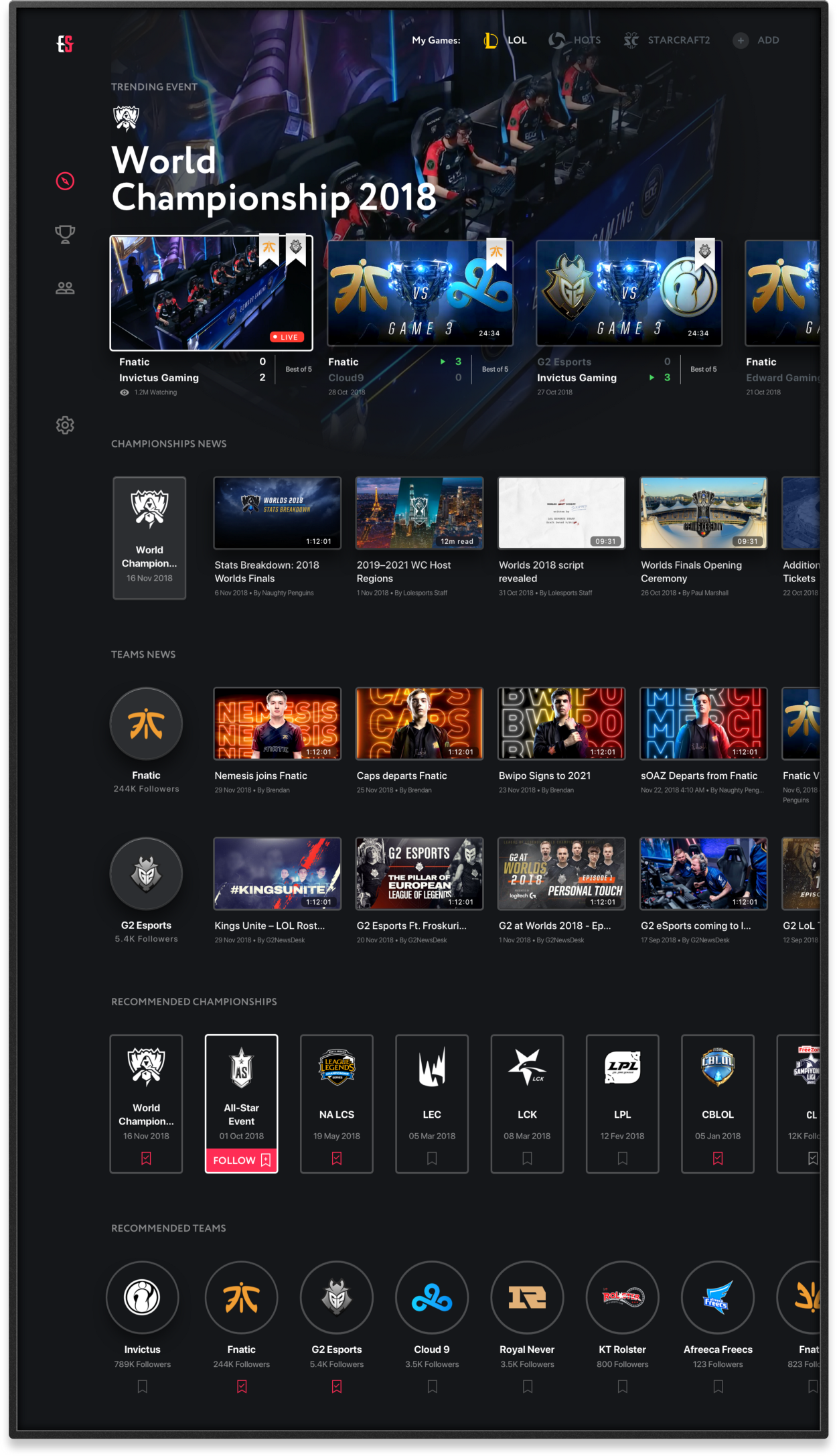
The app’s home screen puts the most interesting and up-to-date information in one place: streams and news for current championships. Home screens also consider user preferences and display events for a user’s favorite teams, players, and championships.
Cool features 🔥
No spoilers mode
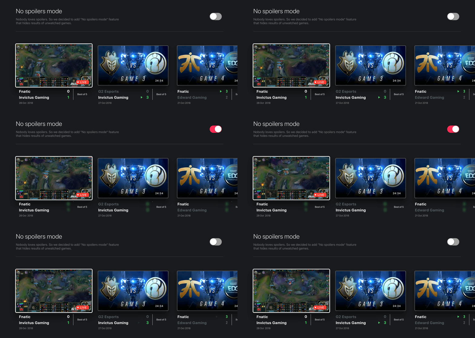
No one likes spoilers. However, many of our screens do show scores. We decided to add a special “no spoilers” mode to the app. With this mode, scores aren’t shown for matches a user hasn’t seen yet. The results of these matches are not displayed in tournament brackets either.
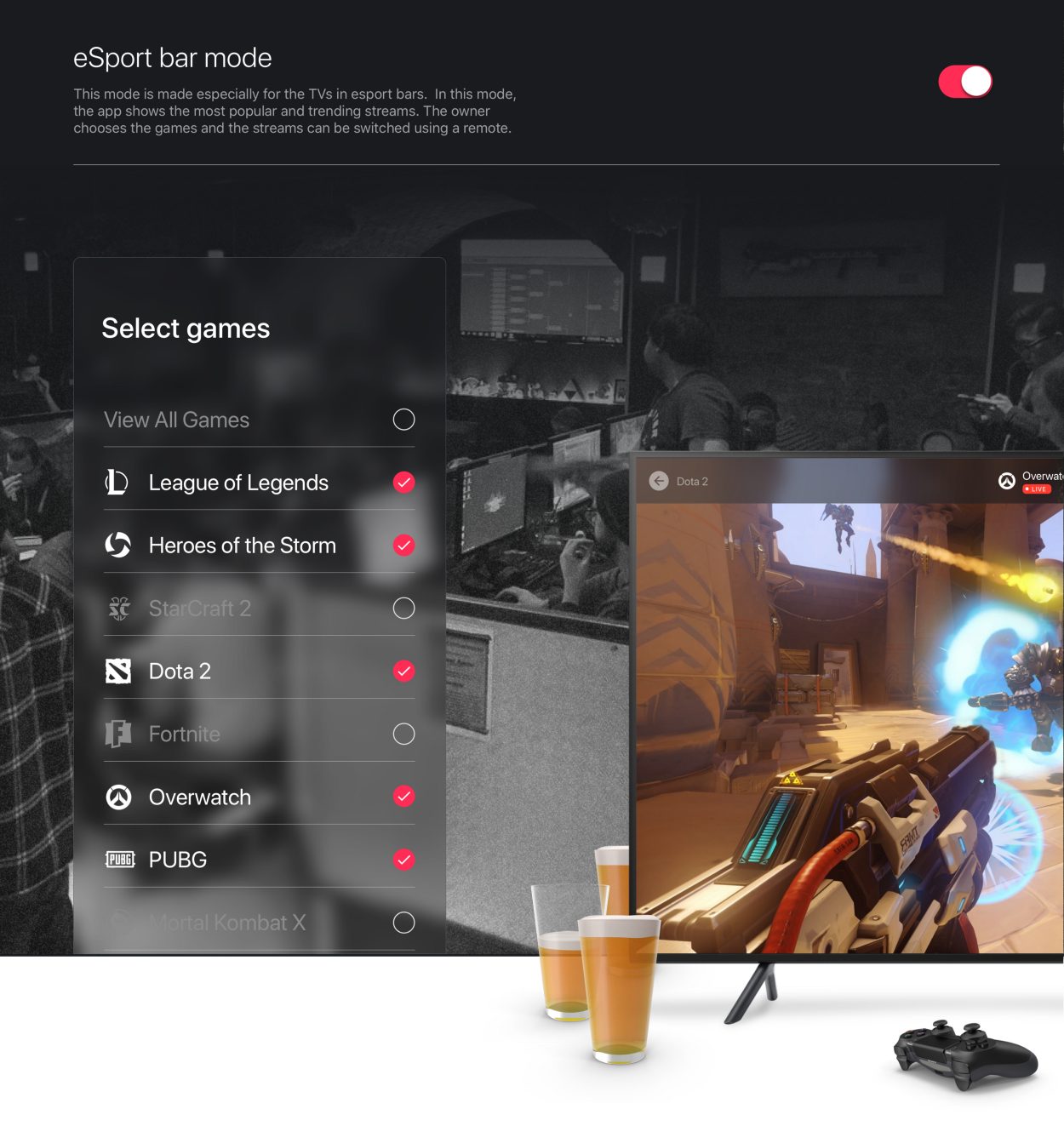
eSport bar mode
eSport bars are places where fans can gather and watch streams of their favorite games together. Sometimes there’s only one screen at these bars, and sometimes each table has their own screen.
The problem is, it’s difficult for bar owners to manage the streams. Finding the most up-to-date stream for the game you need takes time, even with just one screen. When there are many screens involved, it turns into a real nightmare.
We devised a special mode for this situation. eSports bar mode lets bar owners give customers control over only a few specific aspects of the app. In this mode, the app ignores any previously established preferences and shows the most up-to-date and popular streams for the selected game. Only the specific stream and event can be changed, allowing customers at the bar to switch to their favorite games or tournaments with the click of a button on the remote. The home screen, championship screen, and other user-based features will be blocked.
In conclusion
We believe that eSports will soon hold an important place in our culture, on par with sports like soccer, football, and basketball. The goal of our project was to outline our concept for an app that would be more than just something convenient for eSports fans; it would bring eSports into every living room.
This post is also published in UX Planet publication on Medium: https://uxplanet.org/designing-esports-for-tv-8a3d2b0662d0
Please also check our detailed Behance project here.

