The project overview
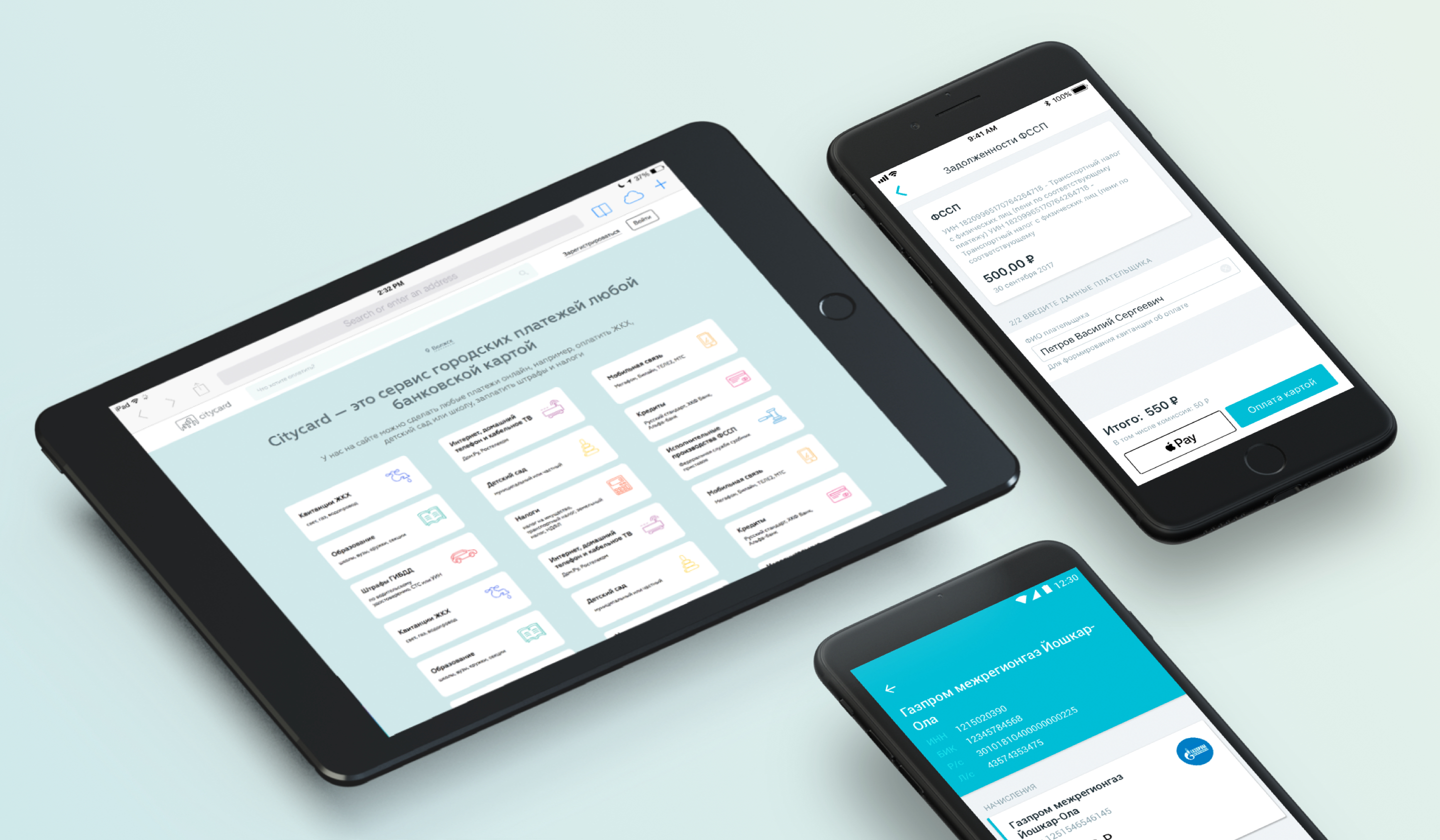
Our team was responsible for creating product strategy, its implementation along with the client’s development team, launching a marketing campaign, and measuring results.
What was done
Metrics and analytics
Our work started with defining what metrics would be relevant for this project to make sure that all the decisions were data-driven and reliable. After conducting a thorough research, we defined two relevant metrics: UAC (User Acquisition Cost) and LTV (Lifetime Value). Thus, all our product ideas and decisions were focused on decreasing UAC and increasing LTV. This way, we were able to ensure that the ROI was achievable so, together with the client’s team, we implemented several software tweaks for collecting data.
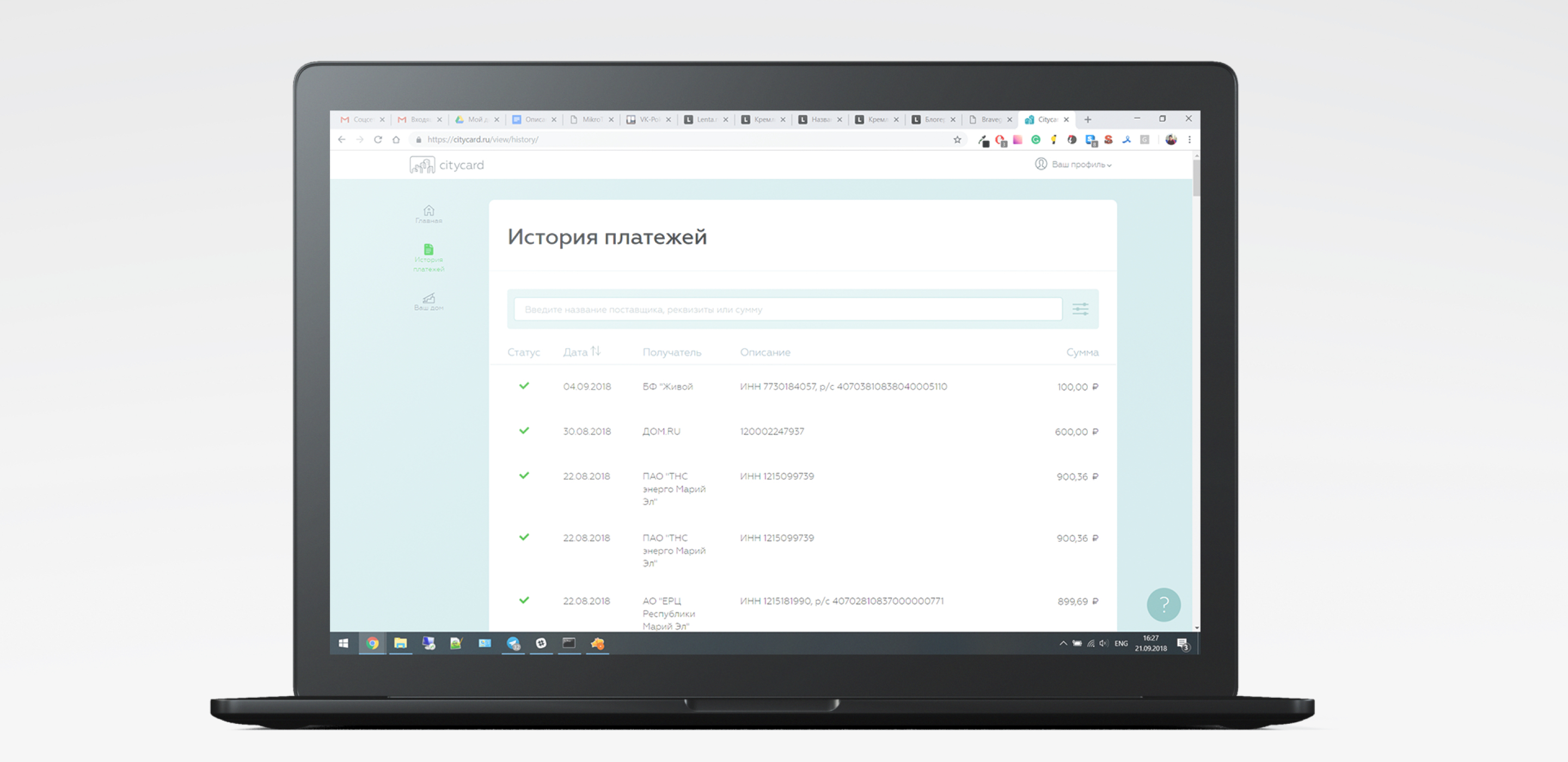
User acquisition process revised
When we started, the initial plan was to make a process of registration mandatory for all users willing to pay their bills through the Citycard service. However, this approach caused a considerable decline in the conversion rate which, eventually, led to the decision of removing this feature completely. Instead, the service would request a users cell phone number after he/she conducted the first payment with an explanation of how that would benefit an overall experience of using the service. Users loved this change.

Next, we decided to create a landing page for each utility provider in the system. It was useful in terms of advertising and SEO.
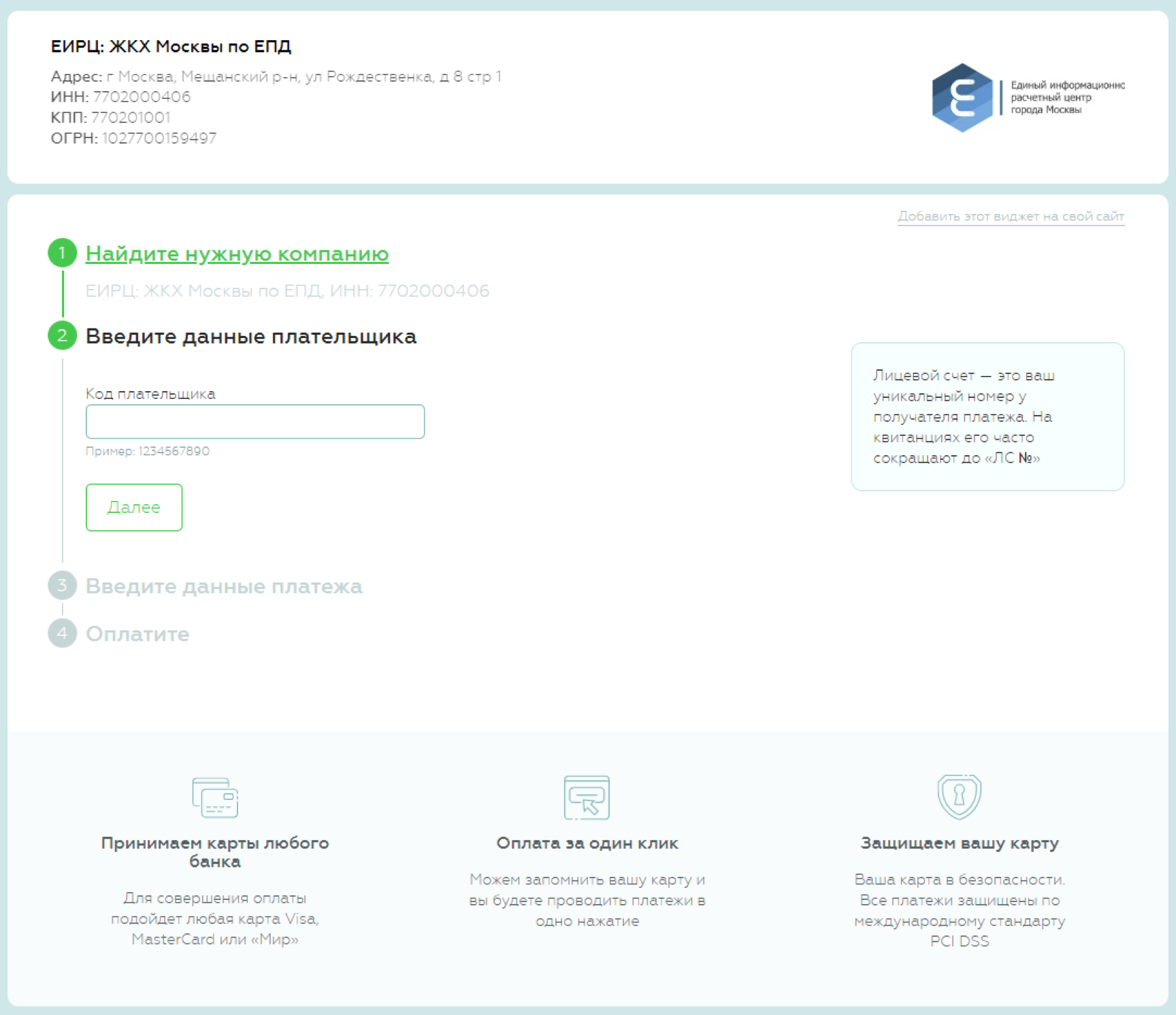
Payment card form changed
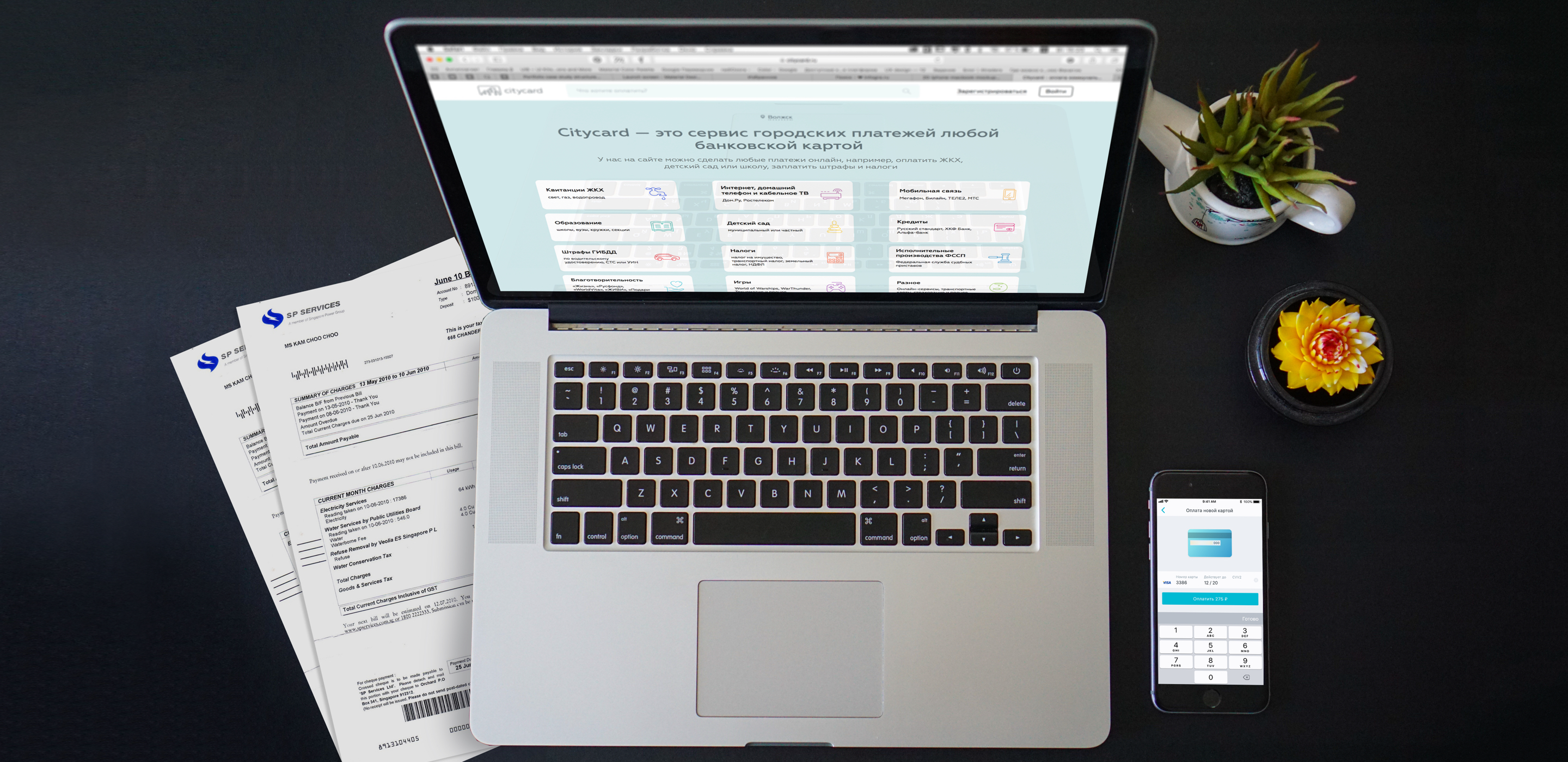
Our analytics tool displayed that the percentage of users bounce was high when they reached the page of making a card payment so we realized that the form required some fundamental changes to be made. The reason behind that was easy to understand: its design was bulky, complicated and did not appear trustworthy. Hence, we redesigned the whole form according to Citycard brand guidelines, made it responsive and easy to comprehend.

Notifications
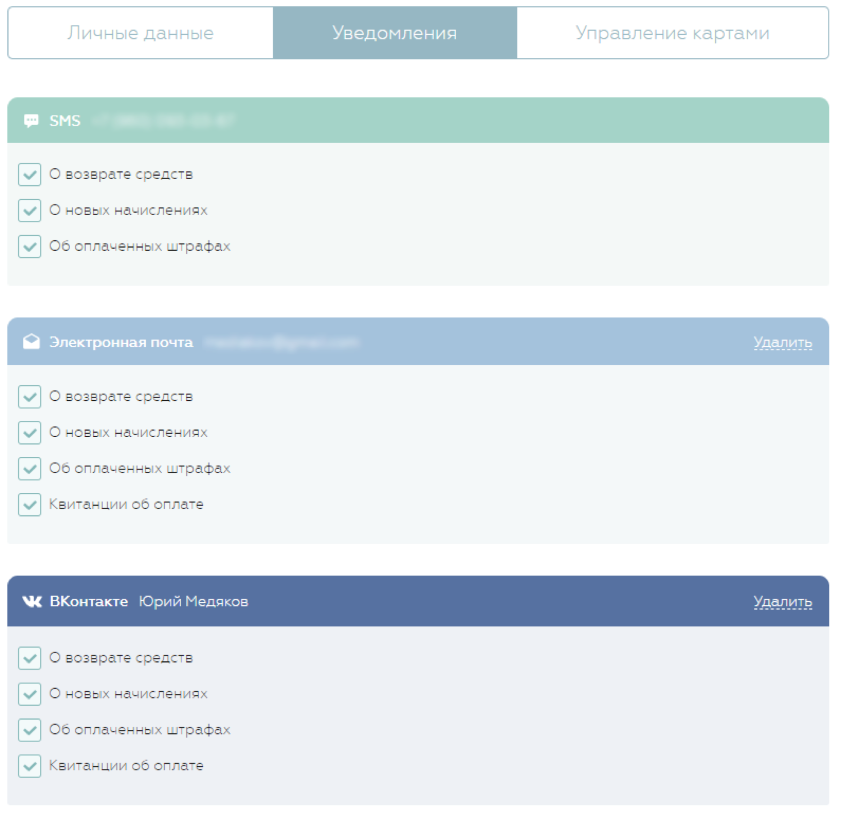
When we started working on Citycard, it only offered one type of notifications: via SMS. People received the information on their utility bills and a direct link to an according page on the Citycard website. Based on analytics data, we found out that users in Russia preferred to make this kind of payments on their desktops rather than on their mobile devices, so the SMS was making a process of following the link inconvenient for a user which lowered an overall engagement level of the service.
Thus, we decided to add a couple of other notification channels: emails, VK-messages (the most popular social network in Russia), and Telegram messages that was easy to use both on mobile devices and a desktop. Users could select one of those in a brand new notification center.
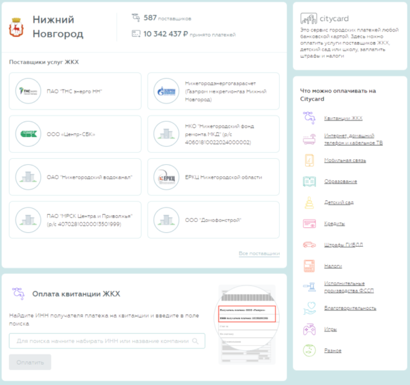
City landing pages
We analyzed the SE statistics and found out that people generally searched for utility payment solutions located at or, at least, adjusted to their own city. Based on this data, we decided to create separate landing pages for all the major cities in Russia. Thereafter, on each of these pages, a visitor is able to find a list of local utility providers and additional information about their rates and services according to his/her address.
Mobile apps
We received hundreds of comments saying that our users would love to use Citycard as a mobile app as well. So we started designing and developing a native mobile app for both Android and iOS, while a responsive mobile version of the website had already been launched and was successfully running.

The outcome
The user experience enhanced significantly after we eliminated the problem with a card payment bounce and created an easy-to-understand, user-friendly design. Those changes have led to the growth of the loyal audience by 10 times and improved the engagement level by at least twice. The ROI requirements were met.

